I get a lot of emails from my readers asking how I take my blog photos and whether I can share any tips. Its also the thing I get the most compliments about which is so flattering as I certainly don't consider myself a photography pro. I often look at other blogs in total awe of their photography so trust me when I say, we're never happy with our own photography! However, I know when I first started out, and even now, how useful photography tips posts can be so I thought I'd put one together and hopefully offer a bit of inspiration. With this being said, I hope you enjoy reading ...Equipment Before you start taking any photographs for your blog, you're going to need a camera. I feel like one of the biggest misconceptions about blogging is that you need a big fancy pants DSLR to take good photographs or to be considered a 'proper' blogger. Now don't get me wrong, I'm not denying the fact that DSLR's are amazing - I use mine daily and can't imagine blogging without it. However, I didn't start blogging with the intention to get a DSLR or buy one specifically for blogging. I was actually very lucky and my dad managed to get me the Canon eos 600d through his business while I was visiting him in Australia a couple of years ago. However, before receiving the camera, I'd been blogging for almost a year and not doing a bad job with the Canon IXUS HS 115 - a standard digital camera. Yes my technique was a bit dodgy looking back at older posts but the image quality itself was perfectly acceptable for someone starting out in the blogging world. I've even used my Iphone for quite a few posts (the main photo in this post was taken with my Iphone) and as long as you get some decent lighting (which I'll talk about soon) and focus, it works perfectly fine. I also don't think there's a huge need for fancy lenses - yes they can help add a different look to your images but other than the 50mm lens which I use for outfit photos, I manage just fine with the basic kit lens.
Look at your settings
The biggest photography game changer for me was working out how to actually use my camera and how to achieve the kind of photos I want - light, bright and clear. Although the auto settings on a DSLR work perfectly fine, they won't create the light and bright images you want, despite the lighting / equipment you have. To really get a control on the lighting, you need to change your settings. I always take my photos on the AV setting and then use the AV button on the back of the camera to up the lighting. All you need to do is turn the dial on top of the camera to AV, hold in the AV button of the right hand side next to the main camera screen and then scroll up or down with the thumbwheel on top of the camera until the lighting is to your liking. I usually set the lighting to around 1 (on that dial in the right image) so my images come out lovely and bright. I know lots of bloggers take their pictures in the manual setting but that's just far too complicated for me and AV seems to work just fine!
Take your own photographs
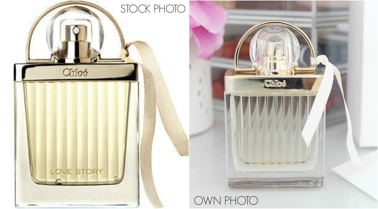
This may seem like a fairly obvious one but I still see a lot of blogs using stock photos (images that can be found via google) instead of photographs they've taken themselves. For me personally, this is an instant turn-off as it looks lazy and it isn't personable. The only time I would ever use a stock photo is for a wish list post as I clearly don't have the products infront of me to take the photos. Lets face it - anyone can go online and search for an image but it shows you've put effort in and your personality if you take your own. Even if you put a lot of effort into the written content of your posts, a lack of images will reflect badly. Just something to think about!
Lighting & Exposure
Its probably the most obvious photography tips of all but natural light is your best friend when taking photos as it allows your camera to pick up more detail and make images appear crisp. Take photos by a window or outside if the weather is nice! I take my images on my dressing table as its right next to a window and allows me to create bright and detailed images. Admittedly its harder in Winter when the weather is dreary but a bit of editing can solve that which I'll talk about shortly. Its also important to ensure your images have the right amount of light - you don't want them to be over exposed or under exposed like the images above. You can usually adjust the amount of light your camera lets in on the settings.I do this using the AV setting as I mentioned above.
Don't shoot into the light
Its important to remember that when you're taking photos you should always shoot away from the light and not into it. What I mean by this is make sure the light is in front of the object you're shooting and not behind it. As you can see in the photos I've taken above, when the light is behind the object, all the camera will pick up is the light behind and not the product itself. However, when the light is in front of the object, it will ensure the product is the focal point and all of the necessary details will be picked up.
Avoid Flash
Unless you really need to use it, try to avoid flash at all costs. Flash has a habit of washing things out or reflecting off surfaces and creating an unattractive glare. If you want your photos to be really crisp and pick up the true colour/detail of a product, natural lighting is key! As you can see in the example above, whilst the left image isn't bad, the flash has created a glare on the bottom half of the lipstick and reflected onto my dressing table. Its also created a reflection off my lipstick holder in the background. In the right photo, the focus is completely on the lipstick and the packaging looks nice and even in tone.
Focus, Focus, Focus!Another obvious one but I still see a lot of blurred/out of focus images on blogs and like the stock photos, its an instant turn off. As you can see in the example above, the out of focus image just doesn't look appealing - you can't see the detail of the product and it looks sloppy. I guess the reason out of focus images are such a turn off is because it comes across like you've not put any effort in. I always try to take at least ten photos of the same product just to make sure I've got one that's nice and crisp. It takes a bit more time but it will pay off!
Angles & Composition
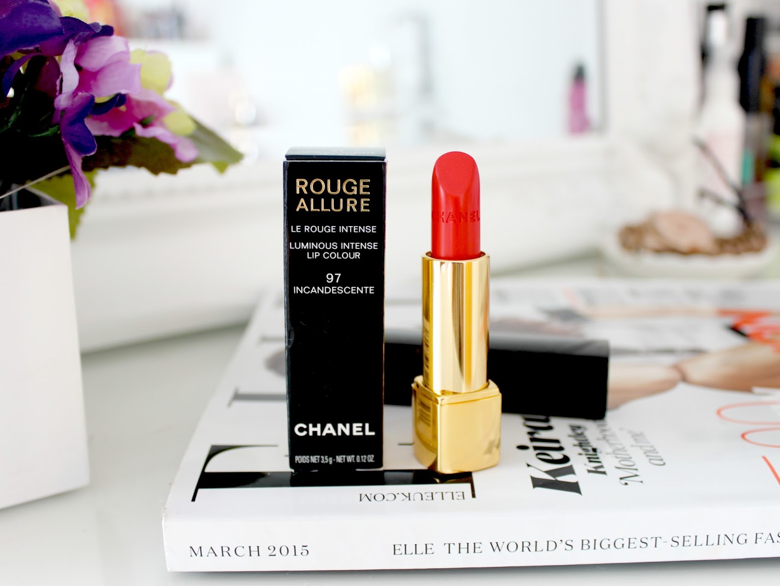
I'm a very creative person and love photography so playing around with different angles is something I enjoy. However, if this isn't your thing it can be easy to fall into a trap of plonking a product on to a plain surface with no thought put into the angles or composition of the image. Its so important to remember that a photo speaks a thousand words so let it tell a story. Add props (flowers, candles, ornaments) into the surrounding areas and take your images from various angles - a birds eye view shot, one straight on and a close up are always good ones to go for. A range of images will make your blog post a lot more interesting! This also brings me on to composition which basically means how much space there is around your image. As you can see in the photos above, the left picture isn't focused on the product - there's too much space and distraction around it whereas the right image is focused in on the product which is what my blog post is about.
Background & Props
Its important to think about the background you're taking your photos on as this is the basis for the whole photo and will give your images a personal touch. I've done a lot of experimenting with image backgrounds since I started blogging as I often like to change things up and make my images more interesting. A few backgrounds I'd recommend include a glass or plain white surface, a wooden floor or some pretty bedding. I used to take my photos of the TV stand in my living room because its glass and I now take them on my white dressing table. I find glass or white backgrounds look lovely and bright which makes the overall image more pleasing to the eye. Bedding, wallpaper and tile samples, fluffy rugs, flowers and cute items blurred in background all look lovely too!
De-ClutterAs I mentioned in my previous point, its sometimes nice to add some pretty accessories in the background of your photos but there's a huge difference between strategically placed accessories and clutter. By clutter I mean general mess that we don't really need to see in the background of an image. You can see what I mean by the photo above. Make sure you find somewhere clutter-free or have a tidy up before you start snapping. For example, the dressing table I take my photos on is often covered with makeup, perfume bottles, cotton pads and what not but I make sure I tidy most of that away before one of my photo taking sessions.
 resized to same width as the post
Resize
Most of my favourite blogs have one thing in common - large images. Images are one of the main features of a blog and the first thing our eye is drawn to so make sure they're large and clear. You can resize images using the standard 'Large' 'X Large' tabs when you hover over a photo but the way I increase the size of my images is by flicking over to the HTML tab when composing a post and changing the 'widths' and 'heights' of my photos. Its best to have a play around until you find a size that suits you and the design of your blog. For reference, the width of my photos is 765 as this matches the width of my post header.
Keep it Consistent
I also think its important to ensure all images are the same width. I'm not sure why but I find it really off putting when reading a blog if the images aren't lined up nicely. What I mean by this is that some of the images will be wide and line up with the font and others will be tall and skinny so they don't match up with the others. If you look at my posts you'll see that all of the images are the same width across as I find it makes my blog look more symmetrical and pleasing to the eye.
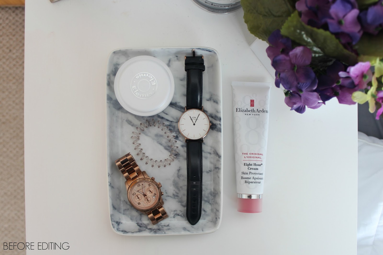 Before cropping and adjusting brightness, shadows and contract on PicMonkey
Editing After you've taken your photographs, the next step is to edit them! I don't spend a great deal of time editing but I do make a few basic changes such as cropping, brightness, contrast, shadows and highlights. I do most of these thing on iPhoto but I also use PicMonkey as I find I can get my pictures nice and bright without over exposing them. I also use PicMonkey if I want to add text / a shape to my image or make a collage. I edited all of the images in this post using PicMonkey. Its super simple to use and does the job well. Renaming
Not a lot of people realise how important it is to rename images. I never used to do this when I first started blogging but I read a post about SEO and it mentioned that search engines won't find or list your images if it has a name like 'D54802' which is standard with most cameras. If you want someone to find your post about a MAC lipstick, rename your images 'MAC lipstick Review' so google and its little spiders that crawl our blogs for info will know what the image is. I also like to add a little summary of what my post is about into the 'properties' section of my images too. I've popped an example from this post above!
So there we have a few of my photography tips! I know most of them are fairly simple but sometimes its the simple things that really do make all the difference. Let me know your top tips in the comments below :)

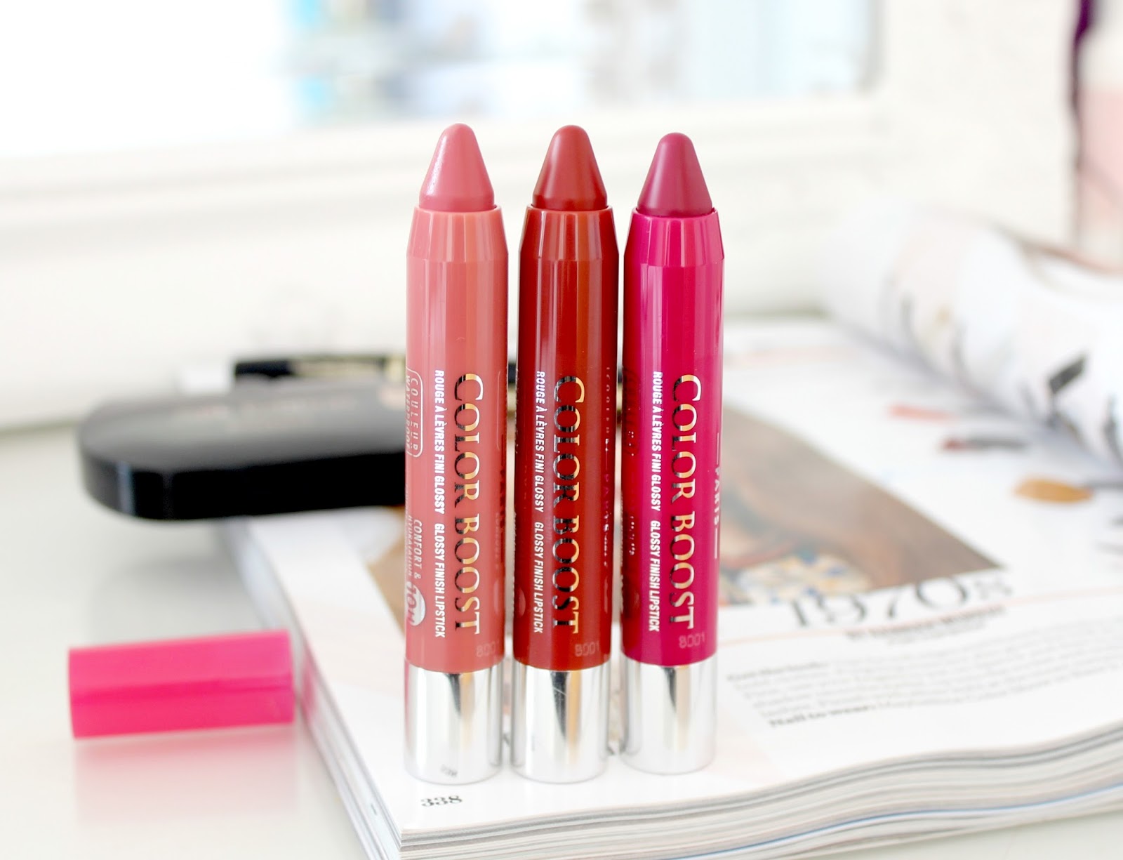
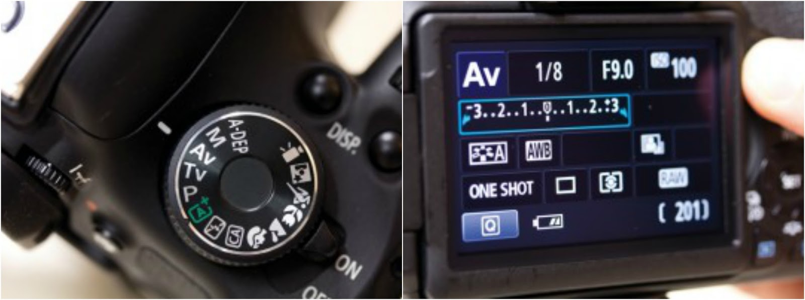 Image source: Link
 resized to same width as the post
 Before cropping and adjusting brightness, shadows and contract on PicMonkey